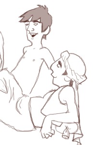
Working on my laptop can be incredibly frustrating. It’s fine for my normal internet routines and for word processing and music, but when I try to use my Wacom Intuos with Photoshop, things grind to a halt. Eventually, I plan on remedying this teeth-grindingly annoying situation, but for now I have to flit back to campus like all the other plebes to use their sticky-keyboarded Macs. Nonetheless, in four hours of uninterrupted work, I have a really good groundwork laid for the Rudyard Kipling comic.
This is the latest WIP. A lot of linework has to be finished and the coloring has barely begun, but it’s taking shape. I’m still trying to decide if I want to use a proper typeface for the lettering, or if my own handwriting would be better.

